Designing a Logo That Converts: Strategy Over Aesthetics
A logo isn't decoration—it's a conversion tool. In a world of fast scrolling, your mark must grab attention, build trust quickly, and nudge action. Here's how to design a logo that performs across channels.
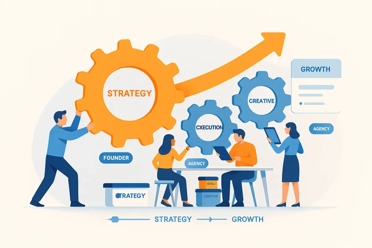
Think Strategy, Not Just Style
Start with function, context, and differentiation—not favourite colours. Define audience, primary contexts (header, app icon, packaging), competitive landscape, and desired brand feeling before sketching.
Keep It Simple — Your Brain Will Thank You
Simple shapes and clear focal points are easier to recognise and recall. Aim for one or two colours, bold lines that scale, and a single visual centre of gravity.

Make It Work Everywhere
Optimise for responsiveness and speed. Use vector/SVG, ensure legibility on light and dark, test at favicon and social avatar sizes, and check motion use in video.
Consistency Builds Trust
Create a mini style guide: size rules per placement, colour options (full/one-colour), and lockups (horizontal, stacked, icon-only). Consistent repetition breeds familiarity—and trust.
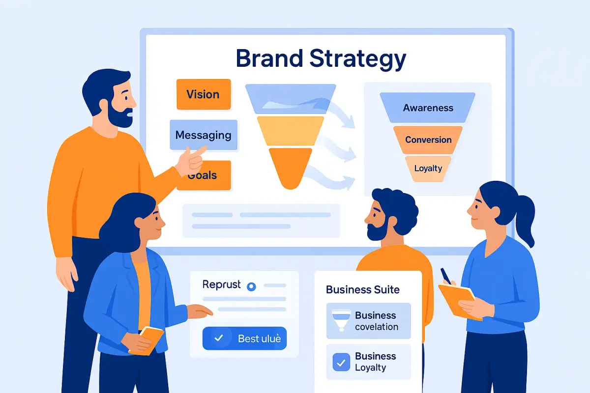
It's Part of Your Whole Brand Story
Make the logo harmonise with typography, colour palette, imagery, and tone. When the system clicks, every touchpoint reinforces the same message.
Know When It's Working
Measure recall, click-through, and engagement. Use quick surveys, A/B test logo treatments in ads, and monitor performance shifts during rollouts.
Bottom Line
Treat your logo like a performance asset: strategic, simple, versatile, consistent, and measured. That small mark can do big work.
