
The Psychology of a High-Converting Website
Is it design or psychology that gets users to click?
Every interaction on a website happens under time pressure. Trust, attention, reassurance, and decision fatigue shape whether someone clicks, scrolls, or bounces. Users form an opinion in about 0.05 seconds—often before reading a single line. High-converting sites respect how the mind scans, filters, and decides.
Below are six psychological drivers behind high-performing websites, drawing on cognitive science, UX research, and conversion optimisation.
First Impressions and Trust Formation
Why it matters: most people judge credibility from design at a glance.
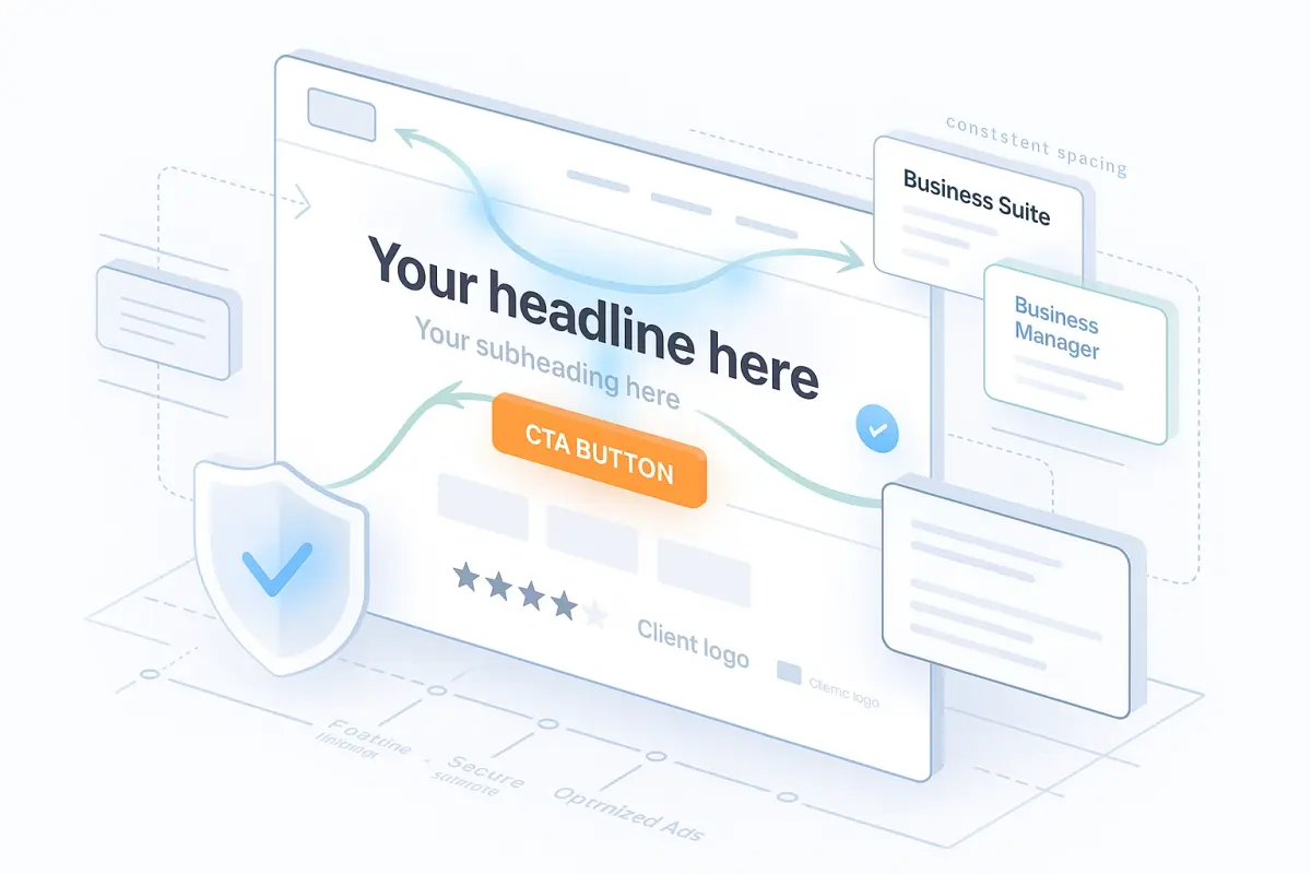
Visual Hierarchy and Cognitive Flow
People scan more than they read. Put the right things in the visual path.
Tip: validate with scroll and click heatmaps.
Behavioural Nudges and Micro Cues
Nudges steer choices without pressure.
Use nudges to reassure, not manipulate.
Clarity in Call to Action
The button is where intent becomes action.
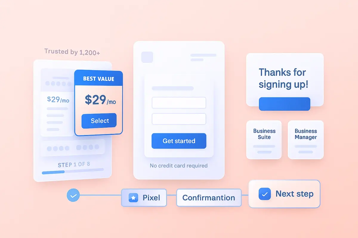
Reducing Friction and Mental Load
Every extra field or click risks drop-off.
Simplify steps and remove uncertainty.
Reinforcing Post Click Confidence
Trust continues after the click.
Good post-click flow supports loyalty and referrals.